Well, this has been one of the darkest and dreariest weekends that Georgia has seen in a long time. Tornado warnings, golf-ball sized hail, torrential rain... we've had it all.

I had grand plans for the project that I was going to tackle this weekend, but had to revise things a bit because I couldn't work outside. Instead, I decided to start on my kiddos' art center in their playroom.

{Note the word "start." I didn't finish everything, but wanted to share my progress.}

Here's the before.


Nothing much to look at. Nothing inspirational. The art supplies are in a closet around the corner - out of sight, out of mind. My oldest son has outgrown the little table. It's a space in desperate need of a makeover! 

So, today I created a wall system for their art supplies. A place where all of the colors, markers, and paints can be seen and used.


To make 2 of these wall units, I used:
  • 1 8' 1"x4" board - to be cut into 2 lengths
  • 2 woven baskets
  • 4 large Mason jars
  • 4 small Mason jars
  • 8 hose clamps
  • A variety of wood screws
  • 6 small washers


So, here's where I started... 


No, it's not the scene of a horror movie.

{Having said that, it might be the scene of a horror movie once my husband discovers I shared a photo of this mess.}

These are leftover materials from the construction of our house. I saved them all from the dumpster. Just think of the project potential!

I found a suitable board (MDF, actually) and laid out my basket and jars to determine how long each board needed to be cut. 


For my design, I needed 2 36" boards.


{Whoo-hoo! Who's the chick working the compound miter saw? Yup. Power tools are my friends.}


Once I had my boards cut, I went to work on 2 coats of white paint. This step was a bit painful for me because I had to work indoors due to the weather. {Do you like how I improvised with the Mega Blocks?}


While the paint was drying, I measured my hose clamps by tightening them around my jars. {Improv again! Who needs a flat head screwdriver?}


I marked the center back to determine where to create a hole for mounting the clamps to the painted board.


To create the screw pilot holes, I used a heavy duty nail and hammer. Tap, tap, tap, WHAM! Instant hole.


The boards dried quickly so I mounted them to the wall studs with 3" wood screws, using washers to reinforce the screws (not necessary if you are using REAL wood).


I then added my clamps, baskets, and jars with 1" wood screws.


I secured the clamps around the large jars as tight as I could get them, but left the small jars loose so that the kids could easily remove them.

I tossed in a few of the art supplies and, instantly, my kids wanted to color.


I mentioned that I built 2 of these. I'll be sharing the final photos next weekend. I have a few more elements to add to the wall and some new (old) furniture coming in.

It's going to be awesome! Be sure to come back for the reveal.

Have a great week ahead!
I'm still in the process of organizing and decorating my studio space. The layout is a little odd because the ceilings slope with the shape of the roof. There is plenty of room, but I've had to get creative with my shelving units.

But we're getting there!

I purchased 2 of these from IKEA and they fit perfectly, laid on their sides under the slopes - with room to place baskets, tools, or sewing machines on top.


During my last trip, I picked up these great green storage boxes to hide my messy stacks of fabric. {Immediate improvement!!!}


So, these handy boxes have a space for labels, but that would be too easy. Not only that, I'm terrible with labels. Want proof?


These drawers don't even contain the materials as labeled.

So, I decided to have a little fun dressing up these boxes, in a way that is beautiful and functional.


I used the label holder {?} as a frame for a lovely piece of artistic paper and created a "charm" out of Shrinky Dinks.

{I still LOVE to play with Shrinky Dinks. They are magical.}

I created my artwork using a free download I found on the beautiful blog, Webster's Pages, as the background for my charms.

Here are my files for your own Shrinky Dink creations. They are already formatted for printing. Just add your text, select "Transparency" as your paper setting, and print away!


The artwork will look washed out, but don't worry! The color will saturate during the baking process.

Cut out and don't forget to punch a hole to accommodate your jump ring before you move on to the next step. {I forgot to do this during my first try! Yeah... I did this project 3 times.}


Bake according to the instructions included in your Shrinky Dink package.

{Learn From My Mistakes}
Instead of baking on top of a paper bag, I use wax paper. I have had a lot of trouble with my Shrinky Dink projects losing their shape in the oven. I contacted the company and they recommended wax paper. It has worked brilliantly!


Spray your Shrinky Dinks with sealant/varnish and let dry for 24 hours.

Cut several lengths of ribbon.


Add your jump rings to create your charms and tie to your boxes. I created a simple addition with a bead and jump ring.


I think little things like this help to make a creative space really special. I really love the idea of using the label holder as a frame.

I mentioned that I did this project 3 times. Remember? Well, I have several tags that I printed, but didn't cut out. I'd be happy to send them your way so you can have some Shrinky Dink fun. Just leave a comment below and I'll select someone at random on Friday to send a set to.

I hope you've had a lovely weekend! I have been wildly unproductive and lazy. I guess we all need those every once and a while!

Here's to a productive week ahead!

This is not my typical post, but I was reminiscing about the past few days and had to share a few photos.

I had an exceptionally social weekend. It was a fantastic break from the "married-with-2-kids" grind.

My hubby and I enjoyed date night on Friday with a very nice dinner, followed by "A Night with Megan North" at The Opening Act, an awesome little concert venue in downtown Macon.


Recognize her? Megan North is actually my lovely friend, Megan DeLong of Made by Maison. She's somewhat of a local celebrity 'round these parts.

{This girl is tal-ent-ed. And gorgeous. And one of the coolest women I know.}

We came home to discover this sweet little scene... my mommy with my baby.


Totally precious.

And speaking of that little baby... he turned 2 on Saturday!! Here he is with his Uncle Gene.


I started out with plans to bake a cake from scratch and make homemade ice cream and wound up at Dairy Queen. Oh, well. He was the happiest little munchkin you've ever seen!

On Sunday, I hosted our monthly movie club - The Order of the Celluloid Fist. {I have no idea why it's called that or what it means, but we have a GREAT time together.}

So... whew! Busy, busy! Thanks for humoring me.

**smile**

Now, tell me all about your weekend!
Okay. You may be better off not knowing this about me, but I'm sharing anyway.

I have a security blanket in the form of a bright pink fluffy robe. Once I get home in the evenings, we rarely part company. We bonded during my last pregnancy and I just can't let go!

{Hang with me... I'm going somewhere with this.}

My studio has a window that faces the road and I've left it uncovered (no blinds!) to this point to take advantage of all the great natural light. The downside of that means that anyone driving by can see straight in at night and likely believes my home is occupied by a hot pink yeti.

So... yes... a little privacy is in order. Not just for my sake, but for my neighbors, as well...  and my children who have to go to school with their children... the list of those affected could go on and on!

{My Solution}

I used my Silhouette to cut this pattern out of frosty Contact Paper to create a pretty, privacy screen of sorts.


It was time consuming. I had to cut one shape at a time because Contact Paper does not cut the same way that a roll of Silhouette vinyl does. It's thinner and the blade cut right through the paper backing in several places. I then had to place each shape by hand. Transfer paper wouldn't work for this project.


Once placed, I used an Xacto knife and ruler to trim around the edges.


The addition of a single panel allows for natural light during the day and total privacy in the evenings.


I'm fairly pleased with the results. A good solution for a problem that clearly carries such high risk!

And all because of my bright pink fluffy robe.
Graphic design is a major part of my professional life. However, in marketing, you're usually tied to a certain set of objectives - branding, graphics standards, a particular look and feel.

So, the idea of subway art has always fascinated me. It seems so freeing...

{You mean, I can use any words that I want, any font that I like, in any pattern that I wish? Shut the front door! That's awesome.}

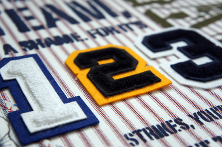
So, I decided to experiment with a few different techniques to create an art piece for Ryder's room. I was also eager to put my sports letters to good use and this seemed like a perfect opportunity.

For this project, I used:

  • 1 18"x24" canvas
  • Scrap fabric (a piece large enough to cover the canvas and a smaller piece to run through my printer)
  • Clear Contact Paper
  • Acrylic paint
  • Sports Letter Appliques
  • Mod Podge
  • Fabric glue

I started by laying out my design (to scale) in Adobe InDesign.

{Feel free to download for your own use.}

I found this vintage baseball graphic at TheGraphicsFairy.com.


I covered my canvas with fabric, adhering with Mod Podge.


Next, I began work on a set of stencils. I converted my artwork into a format that I could trace with my Silhouette software. I exported my file from InDesign as a JPEG.

I traced the artwork, which meant working with a couple of different Silhouette studio files. Because my layout is so large, I had to break down my design into pieces that could be cut with my Silhouette.

{If you would like these .studio files, I'm happy to share! Just e-mail me at rachelhgarza{at}gmail{dot}com.}

I cut the stencils out of clear Contact Paper (trimmed to a size that would run through my machine) and laid them out on my fabric-covered canvas and sponged over the letters with acrylic paint. I wanted the letters to look worn and rough so I used a minimum amount of paint on my sponge.


I've been looking for a reason to try printing on fabric so I decided to make a patch out of a different ticking fabric. I ironed my fabric onto Craft Bond, trimmed to size, and had no trouble running the piece though my inkjet printer.


I used a decorative stitch, reminiscent of a baseball's stitching, to frame around the image and trimmed the excess fabric away. I adhered my "patch" with fabric glue.


If I had it to do over again, I would have used a different fabric. In my mind, these patterns should line up perfectly when layered on top of one another... but this is real life...


I left space in my layout to incorporate a few sports letters. Once I finished painting, I adhered the letters with fabric glue.


Here's the end result.


It's not a terrible first attempt. I'm definitely going to use it in the room. However, I'm not wild about the mix of vintage lettering with more modern appliques.

It was a great learning experience and I'm inspired to do more! I have a few ideas for more subway art for the boys' playroom. So... who knows what I'll have to share in the coming weeks...

Hey! I have an extra baseball fabric print that I made, but didn't use. If you would like it for your own project, leave a comment below. I'll select someone at random next Friday to send it to.
Happy Wednesday!!

I just love my friend, Megan. You've heard me gush about her a time or two {or more}.

She was kind enough to let me share her DIY Fail story with you several months ago. It was a hilarious, yet totally inspirational account!

So, of course, I want you to read all about her newest project: DIY Success - Rainboots!


You'll be glad you did.

**smile**